Liquid Glass in Apple's 27.0 OSs
September 20, 2026
I wrote previously about upcoming design changes to Apple’s 27 series of OSs, but I didn’t run any of the betas myself. From afar, the changes all looked great to me. After having installed the updates at launch on Monday, I’m very happy with just about every visual tweak. But, believe it or not, I still have more grumbles about Liquid Glass.
Before I complain: I need to say that I absolutely adore the Liquid Glass effect in the abstract. When it’s in a clear mode, the refractions are gorgeous! On the other hand, I find it deeply irritating when the material makes text less readable. I want both the refractions and the readability, but it’s a hard balance to strike.
In the 26.1 series of releases, Apple introduced a “tinted” mode. This didn’t solve all my readability concerns, but it helped massively. I prefer dark mode and use it exclusively. 1 I thought the tinted version of Liquid Glass looked quite nice in that mode.
In Apple’s 27 series, the binary option of “tinted” or “clear” was replaced with a slider. When I first heard rumours about this, I was excited. Maybe I could keep the dark glass but play around with how translucent it was? Turns out, no. Even at its most tinted, the material is significantly lighter than before.
For most of the past week, I tried living with the default mid-point on the slider. I gave up almost immediately on macOS and iPadOS. 2 I lasted much longer on iOS, but I found the glass to have an unpleasant milky hue. Now I’m back to full tinted, mostly because it’s the only way I can stand looking at notifications.
With the previous version of “tinted”, especially in dark mode, there was a nice amount of contrast. The material looked glassy and translucent, but it was pleasantly dark. In the 27 OSs, the tinted mode looks dull, matte, and significantly lighter. The worst part: it still uses white text, leading to universally worse contrast. So now I get worse readability and effectively none of the refractive effects. That sucks!
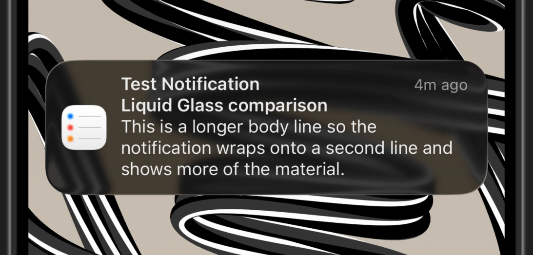
Below is an example of how tinted looked in iOS 26 in dark mode. You can see that it’s a dark material with a refractive effect. The text on top is white, and there’s a good amount of contrast here.
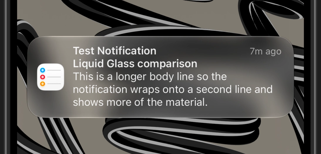
Below is an example from iOS 27 in dark mode with maximum tinting applied — though you might find that hard to believe. The text is white on top of a light, matte, translucent material with no refraction to speak of. Below that is an ugly shadow used to increase contrast, but it doesn’t help much.
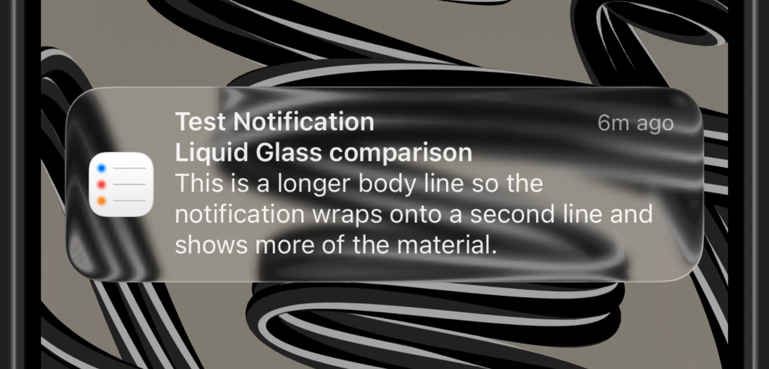
Just for kicks, below is iOS 26 in dark + clear mode.
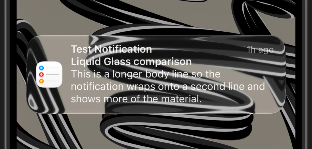
Finally, below is iOS 27 in dark + the clearest mode. In both cases, we have that shadow below the notification. I find this mode verging on unreadable, but the default “middle” mode in iOS 27 looks almost exactly the same as the iOS 26 clear example above.
I’m glad Apple offers an extra-clear mode for people who want. I just wish there were options for those who preferred something darker, too. I liked the “clear but dark” mode from the 26 OSs better than any option I have now. It seems that, if we’re going to have a slider full of options, the tinted end of the spectrum should have much more contrast — especially when in dark mode.
I think the 27 series OSs have markedly improved designs over the 26 series, especially on macOS. I expect things will continue being refined, and I’m hoping Apple will eventually let us have darker glass again. However, the number of changes, tweaks, and options to this material showcases the challenge of working with translucent UI elements. As much as I love the refractive effects at times, I’m just not sure it’s worth it.
-
If there’s any ambiguity about what mode I’m writing about: it’s always dark mode. In my limited testing, everything works better in light mode. I assume this is because it’s the default and Apple spends more time tuning it. ↩