World of Warcraft: Cataclysm UI tweaks
October 2, 2010
Recently I was invited to the World of Warcraft: Cataclysm beta. I’m not actually much of a WoWcraft fiend. I mostly pretend that it’s a single-player game and just enjoy the solo PVE bits. Because of this, there’s a lot I don’t feel confident commenting about. I don’t care if anything has been “nerfed”, as I don’t do PVP or raids. What I do care about is the new experience. Specifically, I’m excited about the lengths to which Blizzard has gone to make the game easier to play for everyone, new and old players alike. Right now I want to focus on the tweaks to the UI.
The new UI solves problems I didn’t even notice I was having before. More than that, there are touches which add flavour and deepen the experience. Here are just a few of the ones I found really notable.
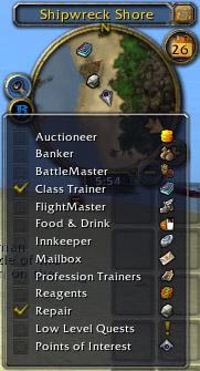
Multiple point-of-interest markers in the mini map
Say you’re an herbalist. Most of the time, you’re going to have “Find Herbs” active on the mini map. When it comes time to search out a mailbox, bank, or repair shop, you could switch to one of those and no longer be herbs on the map. In other words, only one thing could be tracked at a time. Now you can select more than one point-of-interest and they’ll all appear with distinct map icons. Awesome! This is something I wouldn’t have been able to ask for specifically, even though it has always bugged me.
Crafting interface
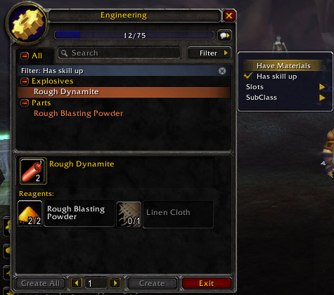
There are now two options:
- “Have Materials”, and
- “Has skill up”
Even at level 40 I’ve had a hard time keeping track of what I need to be crafting. These two filters will help immensely.
New ability notification upon level
When you level up, there is a new overlay displayed. It has a fade-in-and-out effect similar to the text shown when you’re entering a new area. If there are new skills or abilities available at your level, they’re pointed out in this overlay. Now there’s a lot less guessing about when you should visit your class trainer.
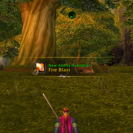
The above image also shows the “content download” widget at the top. I talk a bit more about this below.
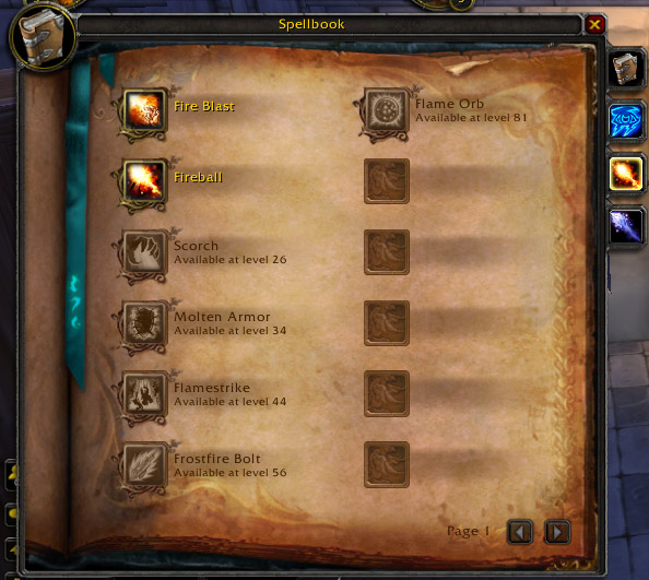
Updated spellbook
This may seem pretty minor, but I was extremely impressed with the look of the new spellbook. It’s much more clean now that there aren’t different levels for basic class spells and abilities.
Updated skills
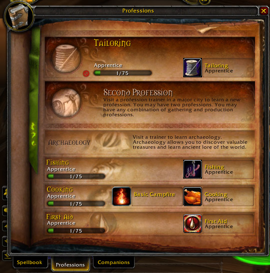
In the same vein, there is now an updated look the the Skills interface, now called Professions. Because there are no more defence or weapon levels, this screen only shows the skills associated with your professions. So much cleaner!
Inline tutorial
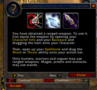
There is now an in-game tutorial. It starts out with simple movement commands and keeps going as you learn more skills. Some may find it annoying, but I think Blizzard has this right. WoW, as it stands right now, is a daunting game to get into. A tutorial is a great step toward making the game more friendly.
Quest directions
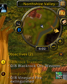
Another step in making the game more friendly is the addition of a “next quest waypoint” arrow in the mini map. This is akin to the sort of thing you see in a lot of other games, and it makes sense here as well. This functionality already existed in the full map, now it’s just easier to see at a glance.
Client update indicator
As I mentioned when talking about the level-up overlay, there is a content download widget which can show up. This is because you don’t have to fully download the game, or the newest patch, to begin playing. The updater will download a certain amount, at which point the game will be “Available”. At this point you can play, but the game will chug a bit as it streams down new content. After a bit more time the game becomes “Playable”, and there are only superficial pieces of content left to download. This seems like a good idea, but I found the “Available” level of play a bit too sluggish.

Overall, I’m really happy to have a chance to test out this new expansion. I love all of the UI changes, as well as the other tweaks which have been made.
I know there are lots of folks getting riled up over these tweaks to “their” game, but I find it all refreshing. Rolling a new mage, even in familiar territory, everything felt new. I suspect Blizzard understands this. Bored players don’t renew subscriptions, and those who have seen it all before need a reason to see it all again.